How might we let an attendant finish a live call
without retyping what the company already knows?
PROBLEM FRAMING
The utility distributes electricity across Brazil. At the time of the project, its call centre ran with 226 attendants in four states, handling around 5,000 requests a day. To size that workload, I queried the CRM's own database and counted 45,257 requests between 10 and 18 June 2020, which works out to 22.2 per attendant per day.
To answer a single call, an attendant needed the client's registration, the contract status, and the billing history. However, each lived in a different system, so the same client was looked up three times and details the utility already had were typed in again. Removing that lookup-and-retype loop was the point of the CRM.
Audience
Core: call-centre attendants working to a script under time pressure, across four states with different service rules.
Constraints
- Attendants worked to an existing call script on a live telephone system, with handling time as the constraint.
- The screen had to remove steps from a live call and sit inside the back-office systems already in use.
RESEARCH
Method overview
To answer questions about the operation and its use, we combined field work with the system's own data. With Gabriela Cestari, a UX analyst on the team, we sat with attendants, conducted interviews, shadowed them through the routine, and timed the old flow at roughly fifteen minutes a call. In addition, we queried the CRM database for requests per attendant, per service, per day, joined to the attendant table for the call-centre departments.
What the data showed
- 226 attendants across four states in Brazil.
- 45,257 requests in nine days, 22.2 per attendant per day.
- Power outages were the single most requested service. In the sample week shown below, 46 of the 71 plotted requests were outages.
Field specification
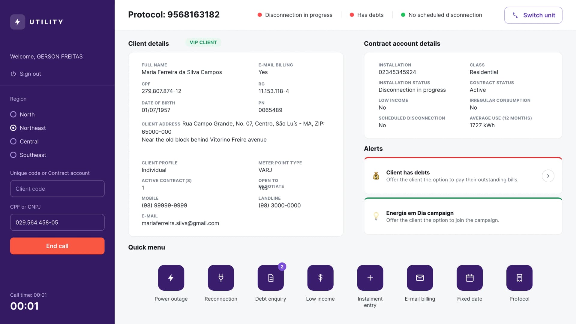
I wrote the field list the screen had to carry before designing it: the client's registration (name, document, date of birth, address, phone, e-mail, client profile), the contract block (installation, class, contract status, low-income flag, scheduled disconnection, consumption), and whether the client was open to negotiating.
IDEATION
After discussing these findings, the team agreed on two changes:
• The three views (client, contract, and billing) had to sit together so nothing had to be looked up twice.
• The busiest services had to sit one click away instead of being buried in a menu.
That became the shape of the screen: a single client view, a quick menu for the top services, and a guided triage for the highest-volume request (power outages).
SOLUTION
The CRM opens on the three things an attendant looks up most, and the services they reach most often. Everything below is the shipped interface, shown with fictional client data.
1. Client, contract, and billing on one screen
The main view brings the client's registration together with the contract status and the billing history, so a call can be answered without switching systems or retyping what the utility already has. The header carries the protocol and the status flags (scheduled disconnection, open debts, no scheduled disconnection) that decide what the call is about.
2. The top services, one click away
A quick menu keeps the most requested services in reach: power outage, reconnection, debt enquiry, low-income benefit, instalment entry, e-mail invoicing, fixed date, and protocol lookup. Each one used to mean another lookup in another system; now they all start from the same client view.
3. A guided triage for power outages
Power outages were the most requested service. The flow puts the call script the attendants already followed onto the screen as a short set of questions: is the client fully without power or is it flickering, is it the whole street or just this house, and then a confirmation. Each answer narrows the request before it reaches the network team, and the call ends with a protocol.
VALIDATION
To validate the prototype, we timed twenty calls on both builds with the same rule: the clock started when the attendant knew the call was this service and stopped when a protocol existed. The old flow averaged about 15 minutes a session, and the prototype about 7. Different attendants ran each build, so the difference does not come from one person learning the task.
The measurement has limits. The two groups of attendants were not matched, so part of the difference may come from the people rather than the screen. Twenty calls describe one operation, not the 226 attendants across four states. The run recorded time only, so it does not show whether the faster calls were also more accurate, and it reports an average without the spread of the individual calls. The attendants knew they were timed, and the test ran on a prototype rather than the shipped tool.
RESULTS
Following the CRM's implementation, we monitored handling time, and the timed run gives a single before-and-after: the prototype cut a session by about 53%, from roughly fifteen minutes to seven.
Because cost per ticket in this operation is attendant time multiplied by salary, a saving of that size carries into cost by much the same share, and it applies to every call the operation takes. Error rate and training time were never baselined, so they are not reported.
The rest of what changed is harder to reduce to one number. The data an attendant used to retrieve and retype now sits on one screen, the busiest services are a click away, and the highest-volume request runs as a guided triage, so the operation figures, 226 attendants and 45,257 requests in nine days, describe the scale the screen served rather than an outcome of it.
WHAT IT LED TO
Following the CRM, the same approach was applied again to contract ownership transfer (in Portuguese, troca de titularidade). I was not on that team, and the numbers are theirs: 21 screens and about 14 minutes a call became 2 screens and about 7, with one click running the whole process and the standard client reply already filled in. It is the same approach on a later service, and the outcome is one my own project could not measure. We are now applying it to another service on the product, Ligação Nova, which is still in development.